Hi everyone,
I’ve been using cleavr for a while now and enjoying it a lot. ![]()
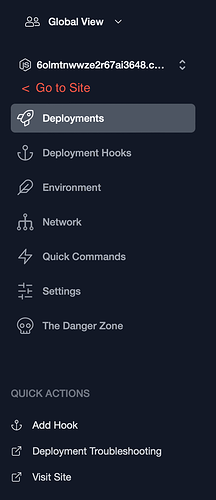
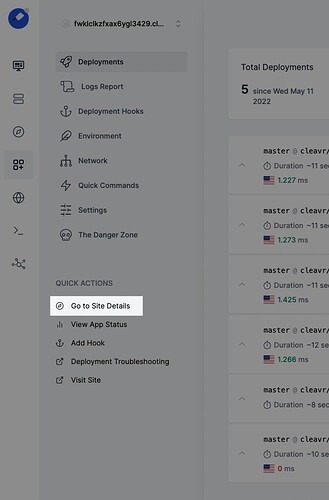
However, there’s a small thing that really bothers me. While managing Webapps, I found it kind of unnecessarily complicated to get back to the site in order to adjust something there and vice versa. In my opinion, a “Go to Site”-Link for Webapps as it exists for Sites to the belonging Server with the “Go to Server”-Link would be very great. It could then simply look like this:
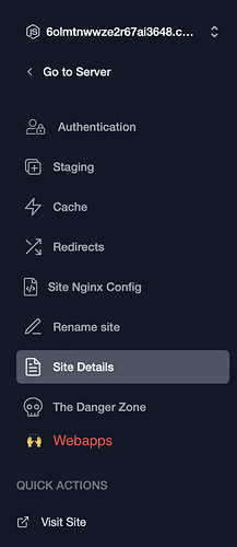
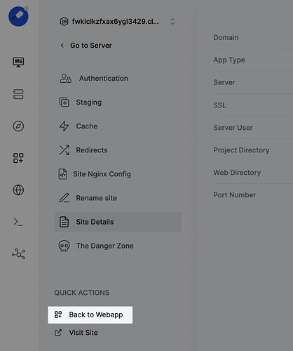
And on the Site view a menu entry “Webapps” could be added where all the Webapps belonging to that Site are listed:
This would make it a very smooth experience for many workflows like for example:
Create new static site → Setup Repo for Webapp → click Go To Site → Add SSL for the Site → click Webapps and select the Webapp (which is easy to find as only the ones for the Site are listed) → Deploy the Webapp → Oops the Site is not showing → click Go To Site → Adjust NGINX Configs → Hooray everything is fine now!
I guess there is not much tweaking required to add something like this to the UI and I bet I am not the only one who would enjoy this a lot. ![]()
Best Greetings,
Jeazyee ![]()


