Hi there,
Here are some ideas it would be interesting to see them implemented 
Look & feel:
-
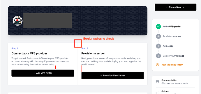
A border radius story
-
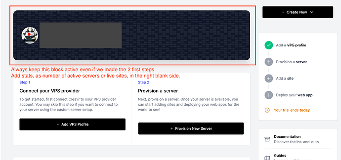
Add some dashboard details
-
Change the title “Slice out your server” in plural.
Edit the server empty subtitle “First, connect Cleavr to your VPS provider of choice. Or, use ‘Custom’ to connect to your server.” to something like “Connect Cleavr to your VPS provider” with a button “Add a VPS profile” / “Provision new server from [VPS]” (with dropdown if more than 1 VPS profile have been set) and a “Or connect your own VPS server” with a button “Provision a custom server” -
Rename the “Sites” name to “Websites” to make it coherent
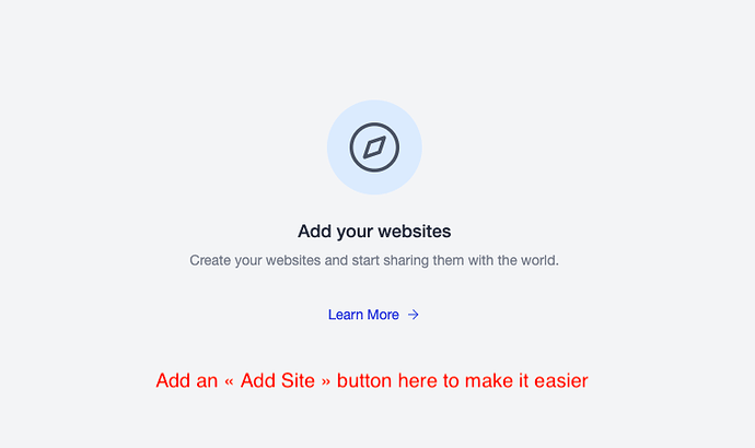
Add a “Add website” button to make it easier
-
Rename the name “Webapps / Deployments” to something more different like “Pipelines” or “Deployments” only (with one word).
Change the title “No Site Created” to “Run your deployments”
Change the subtitle “Provision a server and create a site to get started with deploying your webapps!” to something like “Deploy your webapps by triggering your git push and some other actions.”.
Add a button “Add a deployment pipeline” which enable a server creation or website creation if none of these have been made yet. -
Rename the name “DNS/ Domains/ Records” to “DNS Records” simply
Change the subtitle “You’ll need to create a DNS Profile to get started.” to something coherent like “Connect Cleavr to your DNS provider” with a button “Add a DNS profile” / “Add a new domain from [DNS]” (with dropdown if more than 1 DNS profile have been set) -
Rename the name “Quick scripts” to “Scripts”
Change the title “Automate your work” to “Automate your work with scripts”
Change the subtitle “Set up quick scripts to perform server tasks.” to “Set up automate scripts to perform server tasks.”
→ By the way, here the main button is the only one with a inverse display (transparent background, black border, etc) -
Rename the name “Connection Profiles” to “Profiles” only
→ I think the “Profiles” button should be positionned next to the main profile button (at the bottom of the screen). We talk about configurations here. -
In the dark theme, the tooltip is still in back background which is not so relevant.
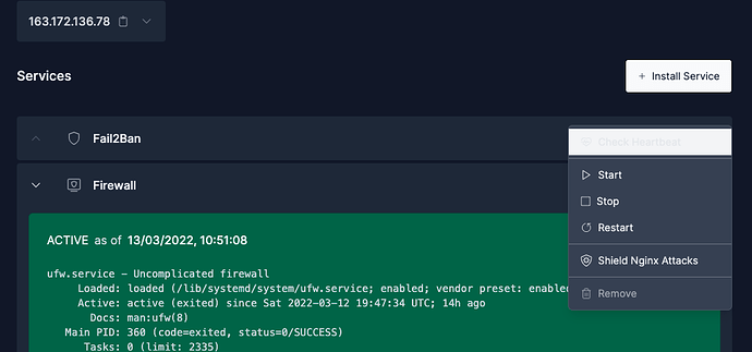
In the Services section, when you click on the 3-dots button without moving your mouse, the first item is in white background:
Providers:
- In France, we use OVH, 1and1 and Scaleway. I’m a user of Scaleway which is a very good provider with their API. Maybe you can connect them

- As a DNS provider, Gandi.net seems to be a good choice too with their API
- For backups, Google Drive or GCP should be a good solutions.
Functionalities:
-
On top of all features, the most important for me is to manage users’ disk spaces and bandwidths.
So the idea is to have a user centric view instead of a site centric view in server details page. With a moitoring of disk space and bandwidth usage, and statuses on SFTP or SSH access, number of sites and databases created. -
An other feature is an alternative to pingdom.com website for each created website. It’s very important in my work to know exactly when my website or middleware have been down to let us calculate the loss.
-
Enhance logs section to something like ELK stack: search into logs, filter on ERRORS only, add the ability to let clients access to some logs only
-
Add some notifications to monitoring like if CPU usage is more like 70%, send a notification
That’s all for now 
Have a nice day to all team.


